Explore the newest advancements of Koyfin graphs that will give you more efficiency and better insights:
- Chart templates library
- Chart templates in LOT
- ETF valuation
- Relative charts
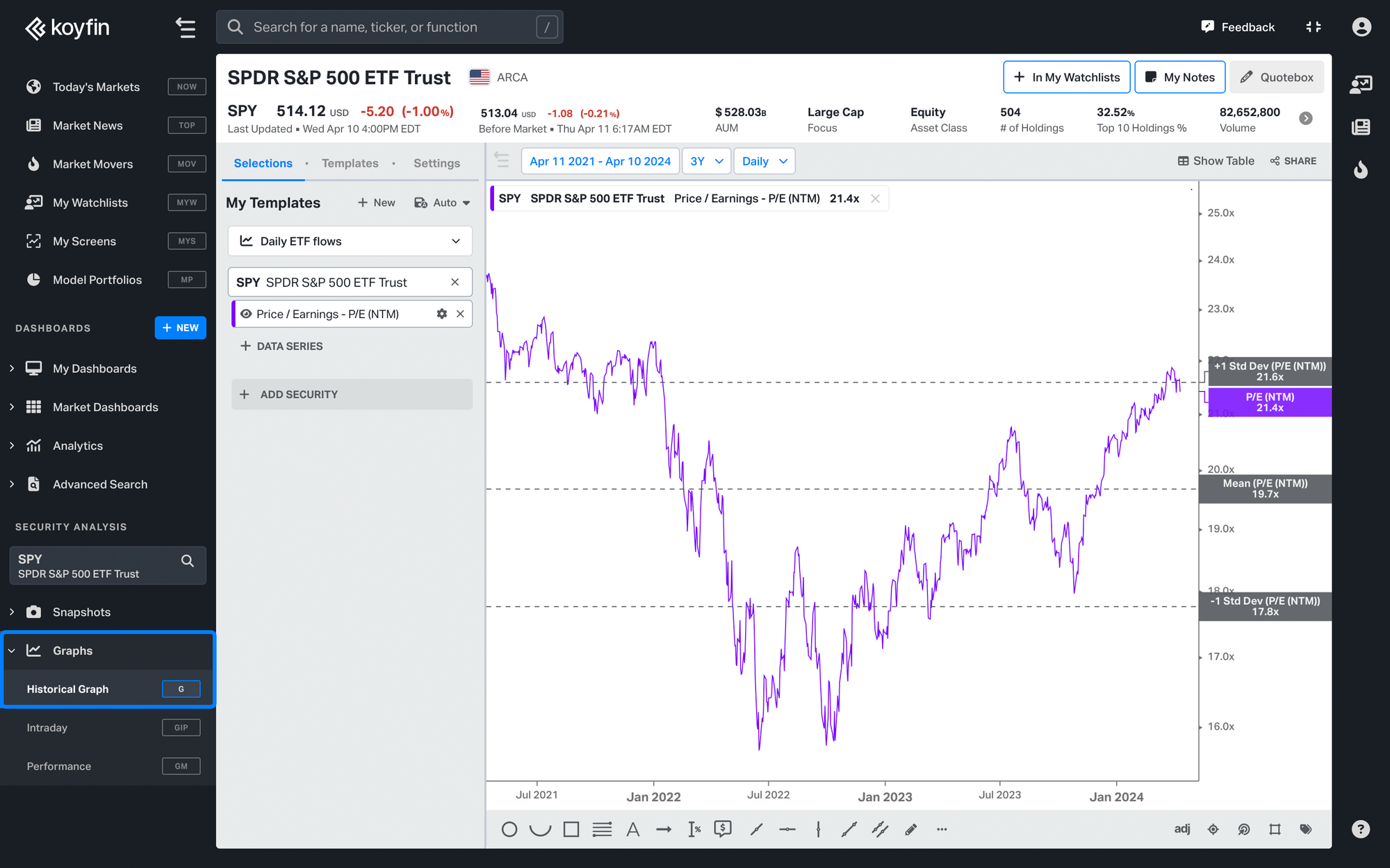
1. Chart Templates Library
Gain deeper insights into your securities analysis with our curated collection of over 25 visually stunning graph templates, offering a seamless setup and rapid analysis process.
To see the chart template library, click on +New next to My Templates in the G chart.
Templates include:
- Price & relative strength
- Margins & forward returns
- Price target & analyst rating
- Dividends & DPS growth
- Weekly moving averages
- Correlation, beta & volatility
- Shares outstanding and % change
- Revenue NTM estimates vs price
- ETF fund flows
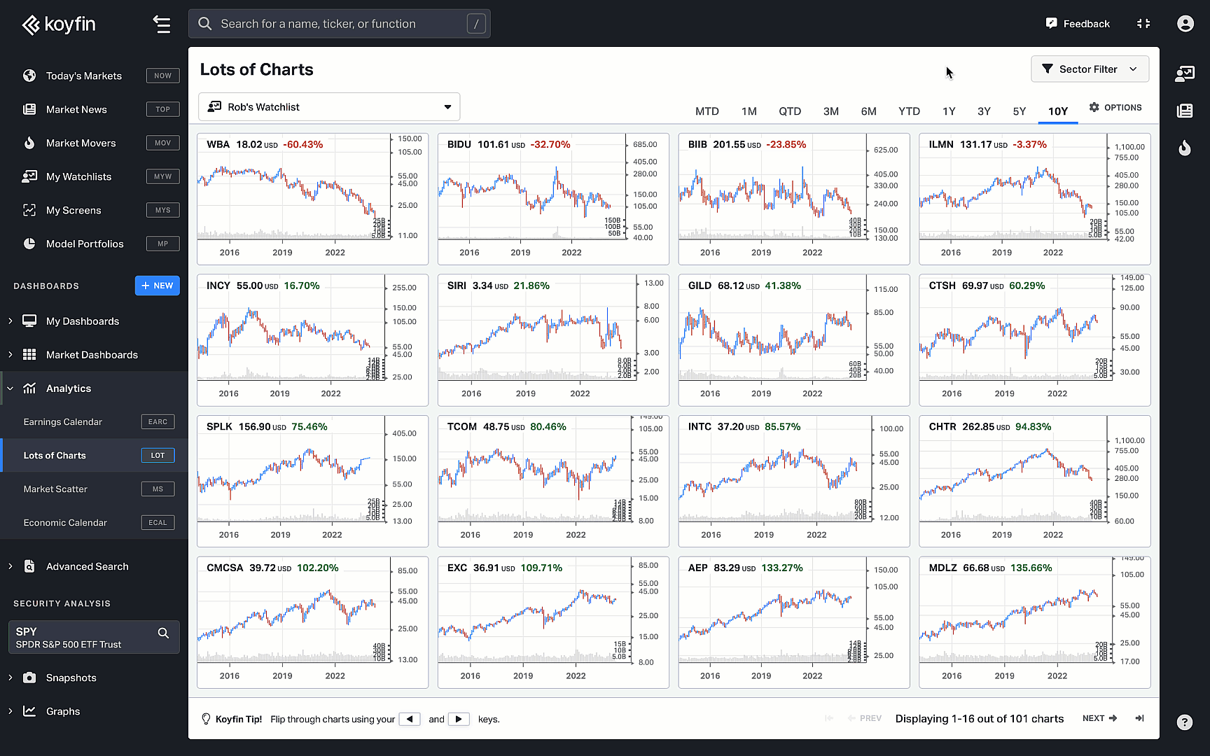
2. Chart templates in Lots of Charts
Effortlessly examine the constituents of an ETF or watchlist with our innovative Lots of Charts page feature. Dive into price charts or utilize customizable templates to delve into fundamental metrics such as revenue or P/E ratios with ease.
Check out this 2-minute demo on how to use templates in LOT.
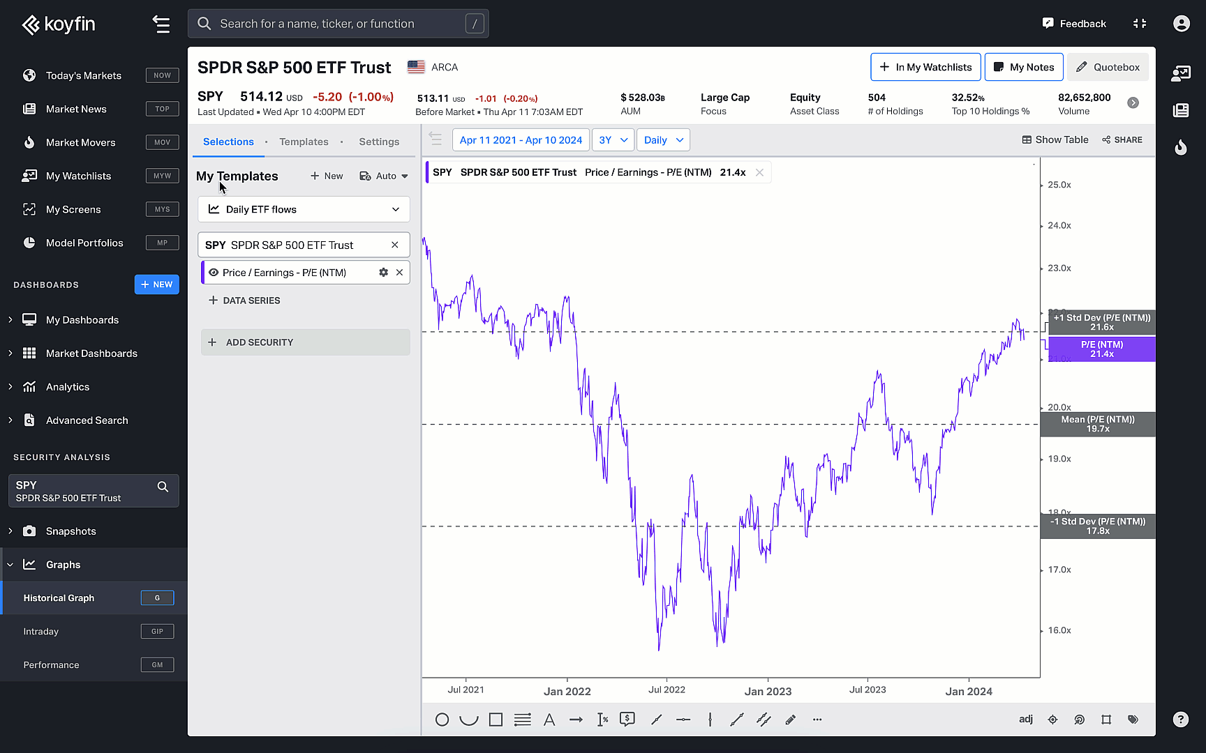
3. ETF valuation
Valuation metrics for ETFs are now also available in charts. Easily visualize and analyze the overall valuation of ETF holdings including major indices like SPY and QQQ with key valuation metrics (P/E, P/B, P/FCF, etc).
Free and Plus users can access valuation for SPY, QQQ and DIA valuation. Pro users have valuation for all ETFs.
Try it out here.
4. Relative charts
Graph the relative performance (or strength) of two securities by expressing their data series as a ratio. Type in CCMP:RTY in the command bar to create a ratio graph of NASDAQ (CCMP) vs. Russell 2000 Index (RTY).
Learn more about relative performance in our help article.