V 3.0.0 - November 28, 2020
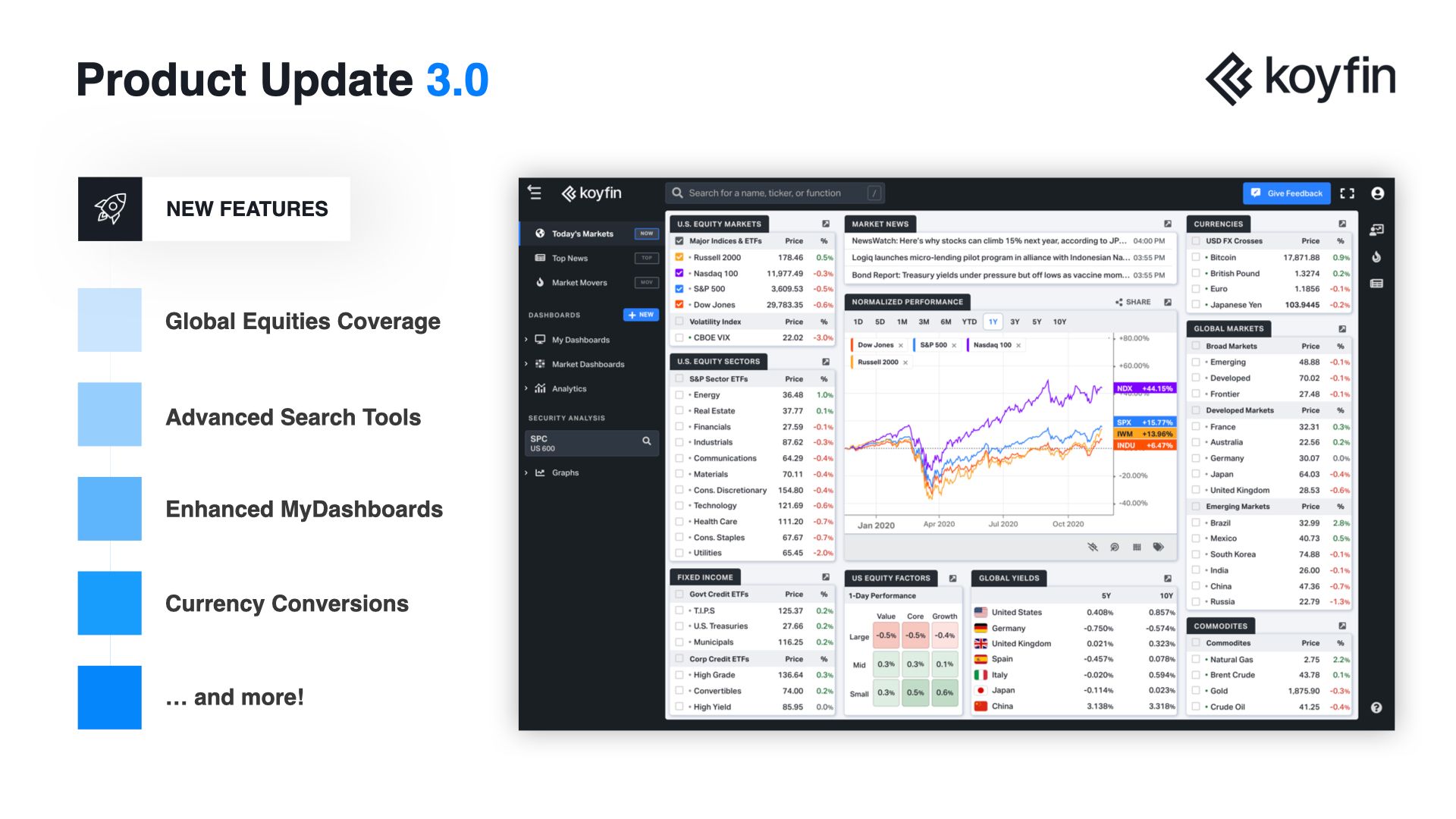
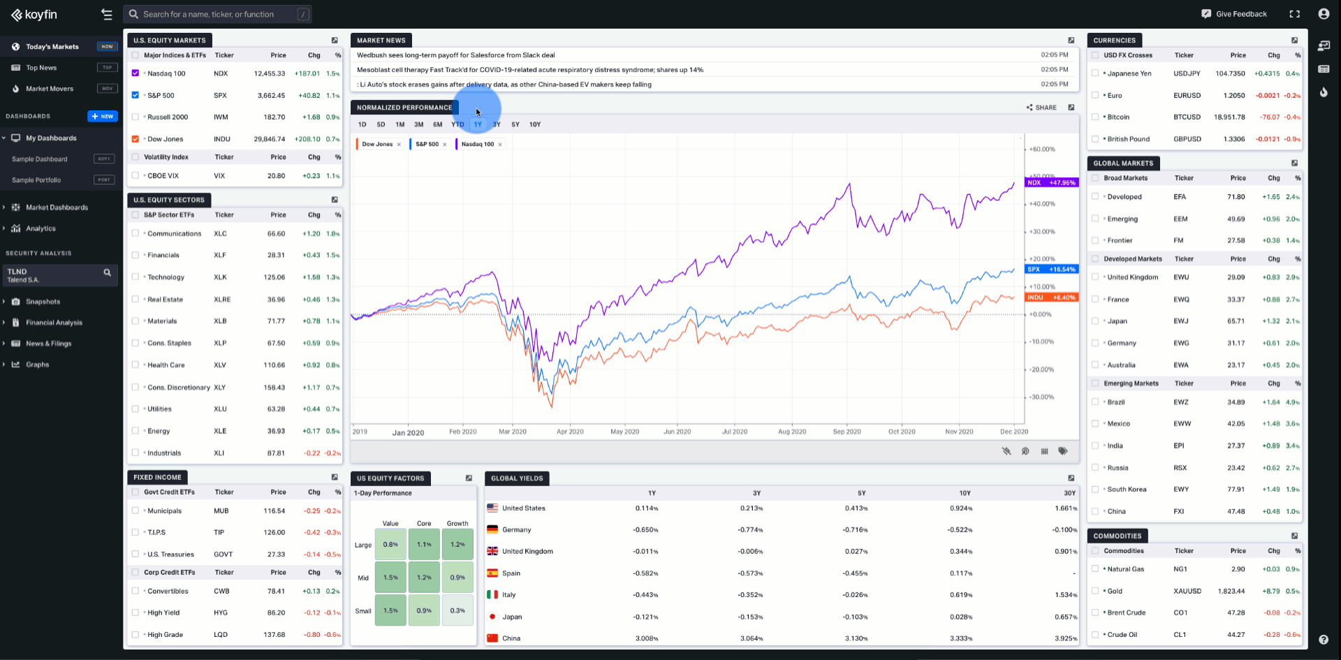
Introducing Global Equities, My Dashboards Widgets, Drag & Drop, and More!
With the latest Koyfin update, we’re introducing lots of new features that you’re going to love. First, our expanded global equities coverage that makes navigating all the markets easier than ever. Next, enhanced MyDashboards with flexible widgets — a long-requested feature that gives you the freedom of customization over your watchlists. Finally, advanced grouping & sorting functionality that helps you discover new actionable insights in less time. And much more!
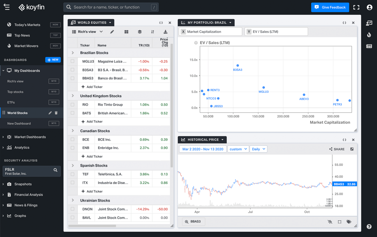
Global Equities Coverage
Go global with Koyfin. We now cover over 110,000 stocks across 209 markets.
With this update, you get comprehensive data on world financial markets, including end-of-day prices, financials, margins, consensus estimates, and valuation ratios for all global equities.
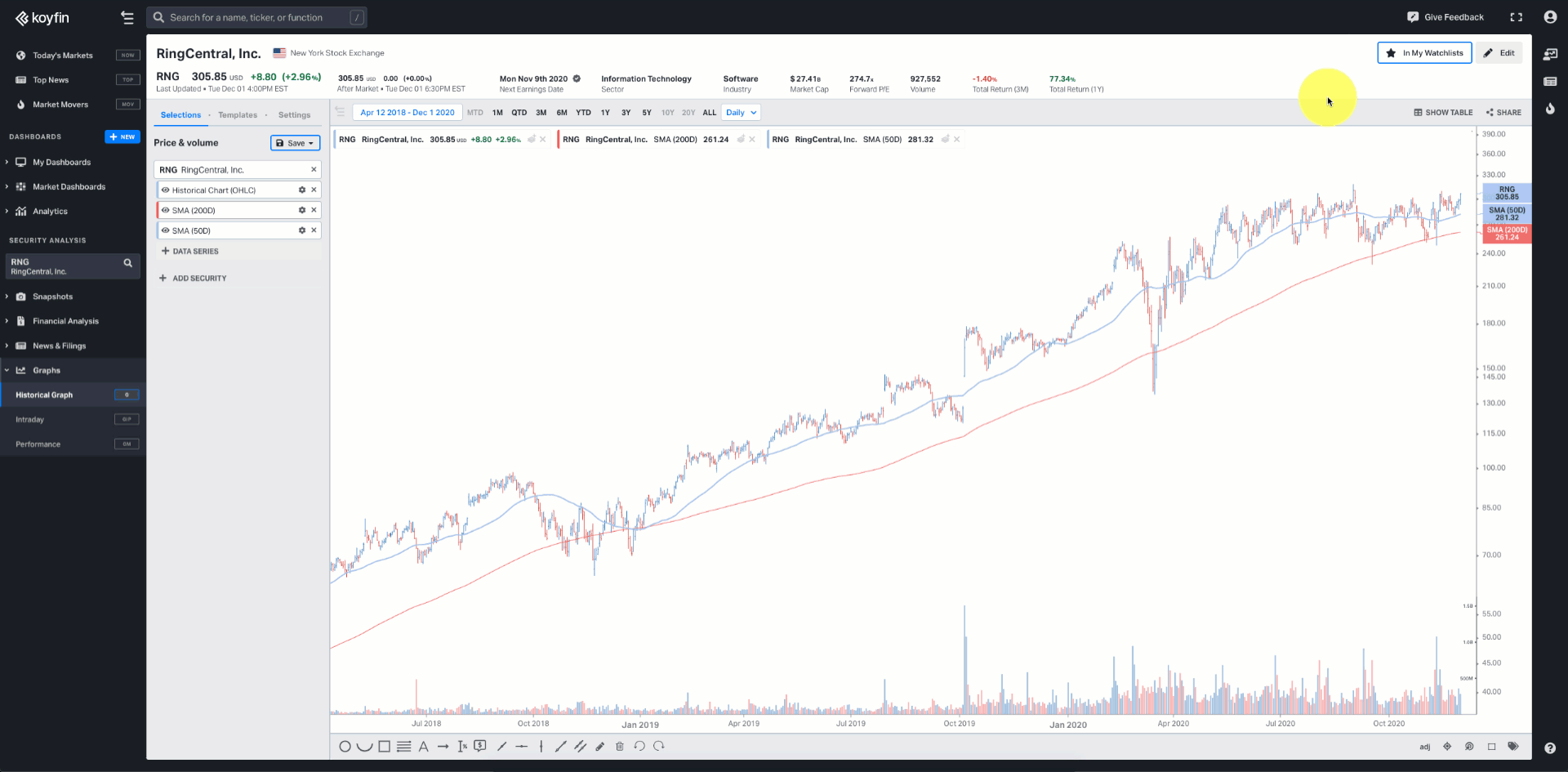
Change currencies in financial statements and graph them against other stocks, indices, or economic series to discover trends and relationships.
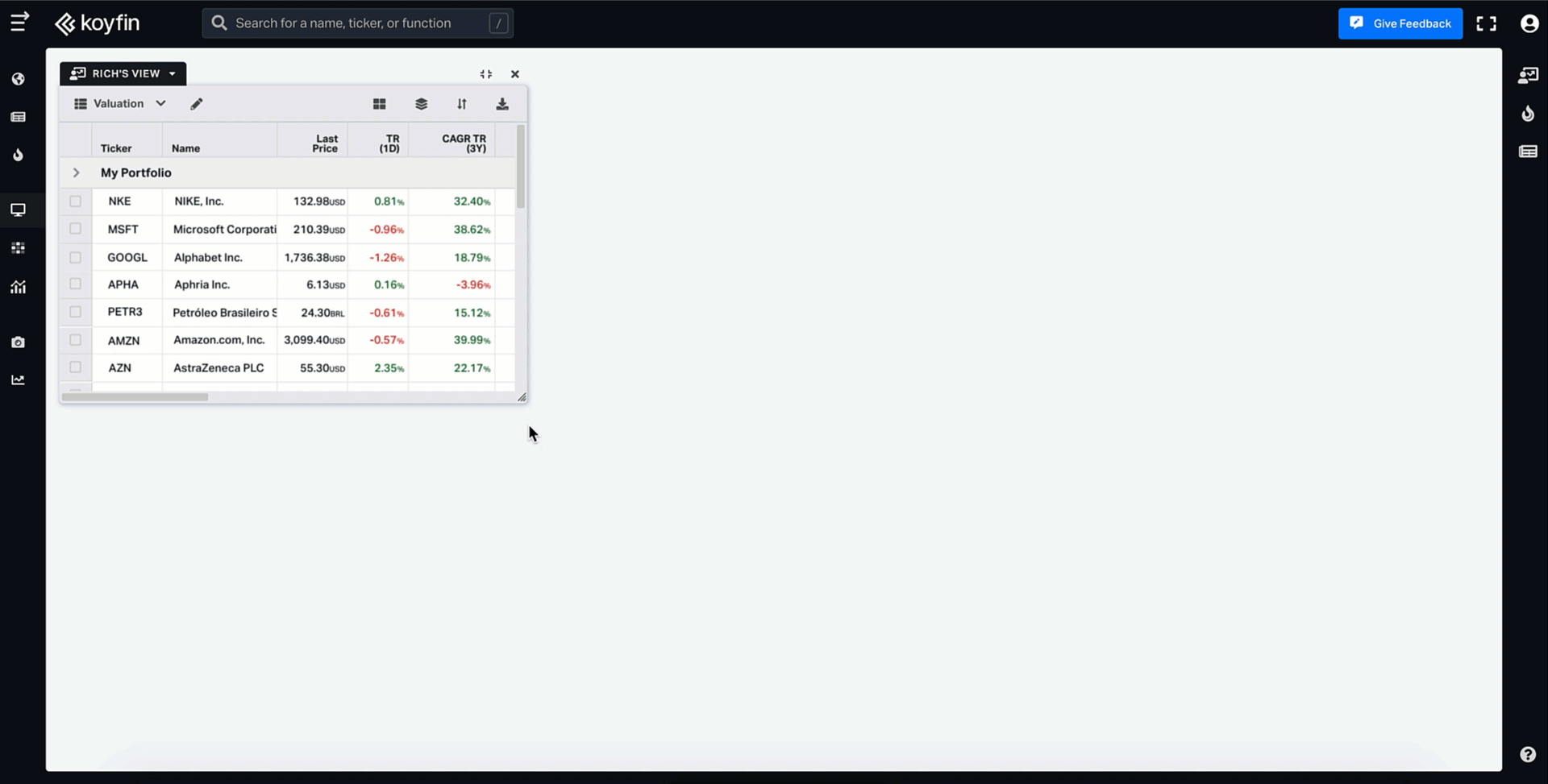
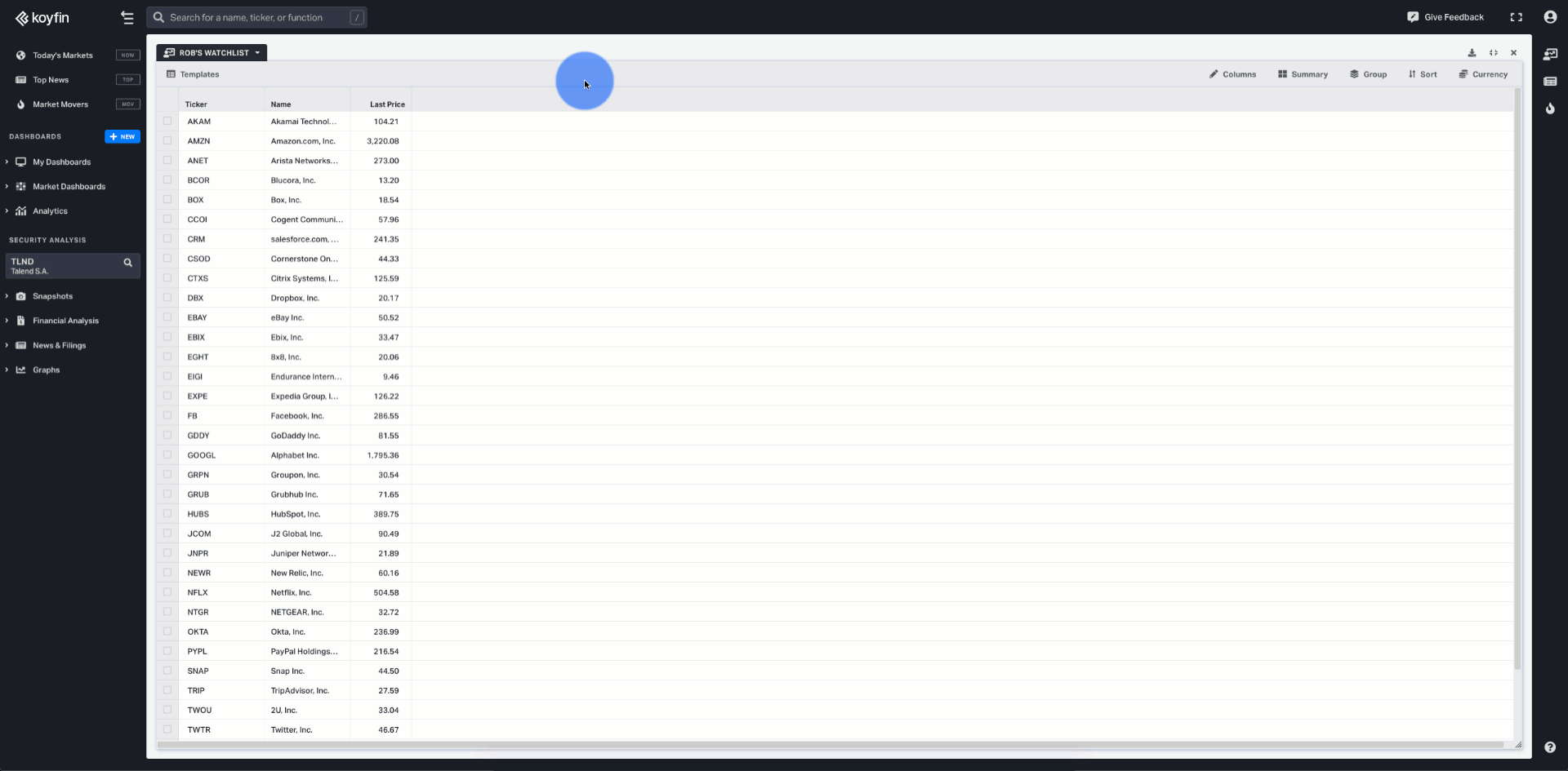
Enhanced My Dashboards
We totally reimagined the MyDashboards feature, so that you can now customize what matters to you the most. From now on, it is a place where stocks, indices, economic indicators, news, and graphs all coexist to make you better informed on the portfolios watchlists you’ve created.
Tailor your dashboards to suit your needs by leveraging flexible highly customizable widgets. Add custom columns with notes and labels, resize and rename them, group, sort, filter, and add summary statistics like average, median, etc.
We now offer portfolio columns like a number of shares, cost basis, and net gain/loss.
Create separate dashboards or watchlists for every asset class you follow, or client portfolio you manage. Set it up once, and save time for other more important matters.
Using Your Dashboards From The Previous Version Of Koyfin
Your dashboards from the previous version of Koyfin are now called watchlists. To access your watchlists, create a new MyDashboard and load your watchlist.
Click on "NEW" in the left menu, Select "Watchlist", and select your existing watchlist.
The column views in the previous version of Koyfin are now called Templates. Load your saved templates, or create a new one.
You can also use your watchlists in the right-side menu to activate the Graph (G), Snapshot (S) or other functions.
Advanced Grouping & Sorting
Get better insights by controlling how data is displayed with advanced grouping and sorting functionality.
You can group securities by predefined groups like a company’s sector or country, or create your own custom grouping in the watchlist.
Sort securities manually by dragging the order of the securities, or by right-clicking on the column header. Once you've mastered the simple sorts, make sure to utilize the more advanced sorting with multiple variables.
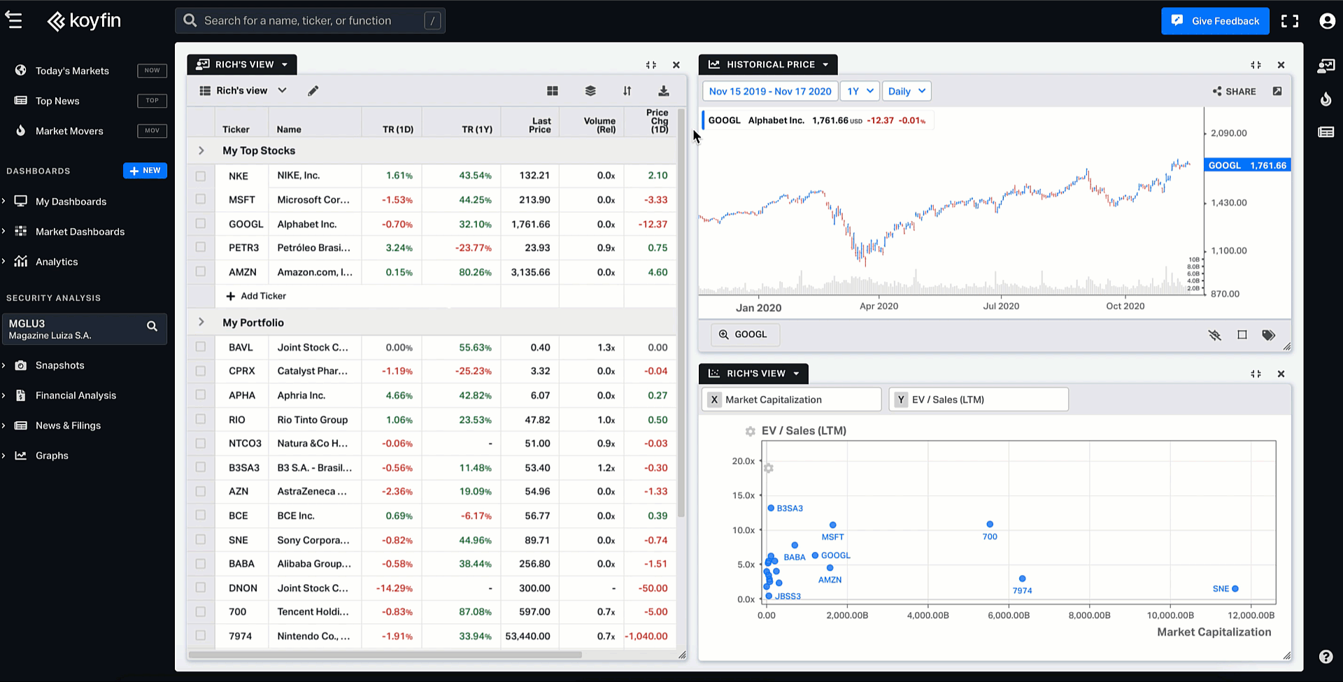
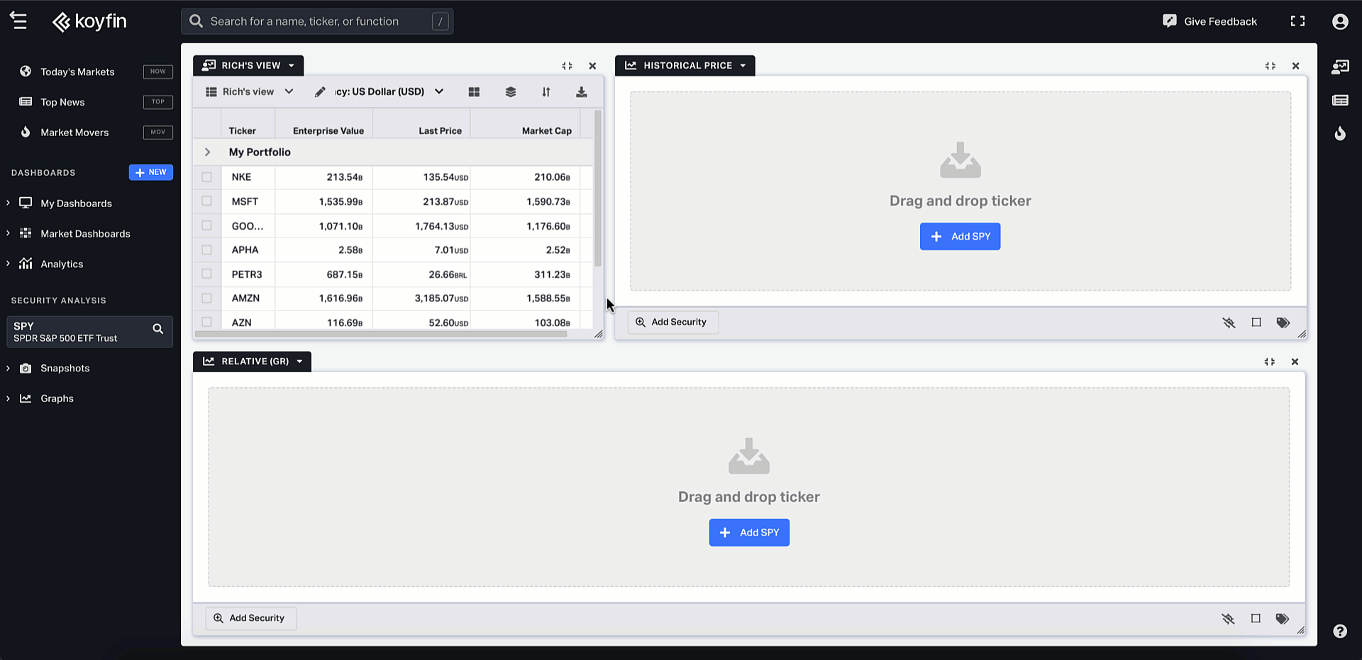
Drag-and-Drop
The new drag and drop feature makes it much easier and quicker to access and analyze the data of companies you're interested in.
Simply use your mouse to drag and drop symbols from your watchlists directly to news, scatter plot or historical price graphs, and data will be automatically updated within the widget.
More updates, improvements, and fixes:
- Powerful Search — We introduced the advanced search functionality which allows more in-depth search criteria, sorting & filtering. Additionally, we provided a new keyboard shortcut “/” to quickly activate the command/search bar. To load a relative ticker, you can use the format AAA:BBB (e.g. AAPL:QQQ).
- Additional snapshots — We expanded the existing wealth of snapshots with Overview (S), Description (DES), Estimate Overview (EST), Price Target (PT), and Revisions (ERT).
- Stocktwits integration — You can now connect your Stocktwits account to create tweets right from Koyfin.
- Scatter plot charts — We added some UI/UX magic to our scatter plots appearance & performance, so that you could leverage the scatter plot functionality as one of the best ways to visualize themes, relationships or outliers.
- Improved UI of custom sharing — Created a more intuitive and functional interface of chart sharing to ensure you can contribute ideas right from the platform — in the form of an image, a dynamic link, a tweet with a chart and your comments, or an embeddable link for your website or blog.
- Better mobile experience — Our mobile web app is updated to work better and faster so you can track markets and your watchlists on the go.
For more information on Koyfin functionality, you can take a look at the Help Center documentation or watch our video.