V 3.15.01 - August 8, 2022
Introducing Graph Transformations!
We are excited to share new expanded functionality for Historical Graphs. Now you can make graph transformations, such as y/y % change, and statistical measures, such as mean and +/- 1 standard deviation, on fundamental series in graphs. The feature will allow you to visualize trends in a company's financials and valuations to help you make better-informed decisions.
Transform Data
You can now transform any fundamentals series like revenue, EBITDA, EPS, Shares Oustanding, etc. into:
- As Reported
- YoY Growth %
- YoY Change
- QoQ Growth %
- QoQ Change
- Performance
- Cumulative
- Drawdown (%) from All-Time High
- Drawdown (%) from Peak
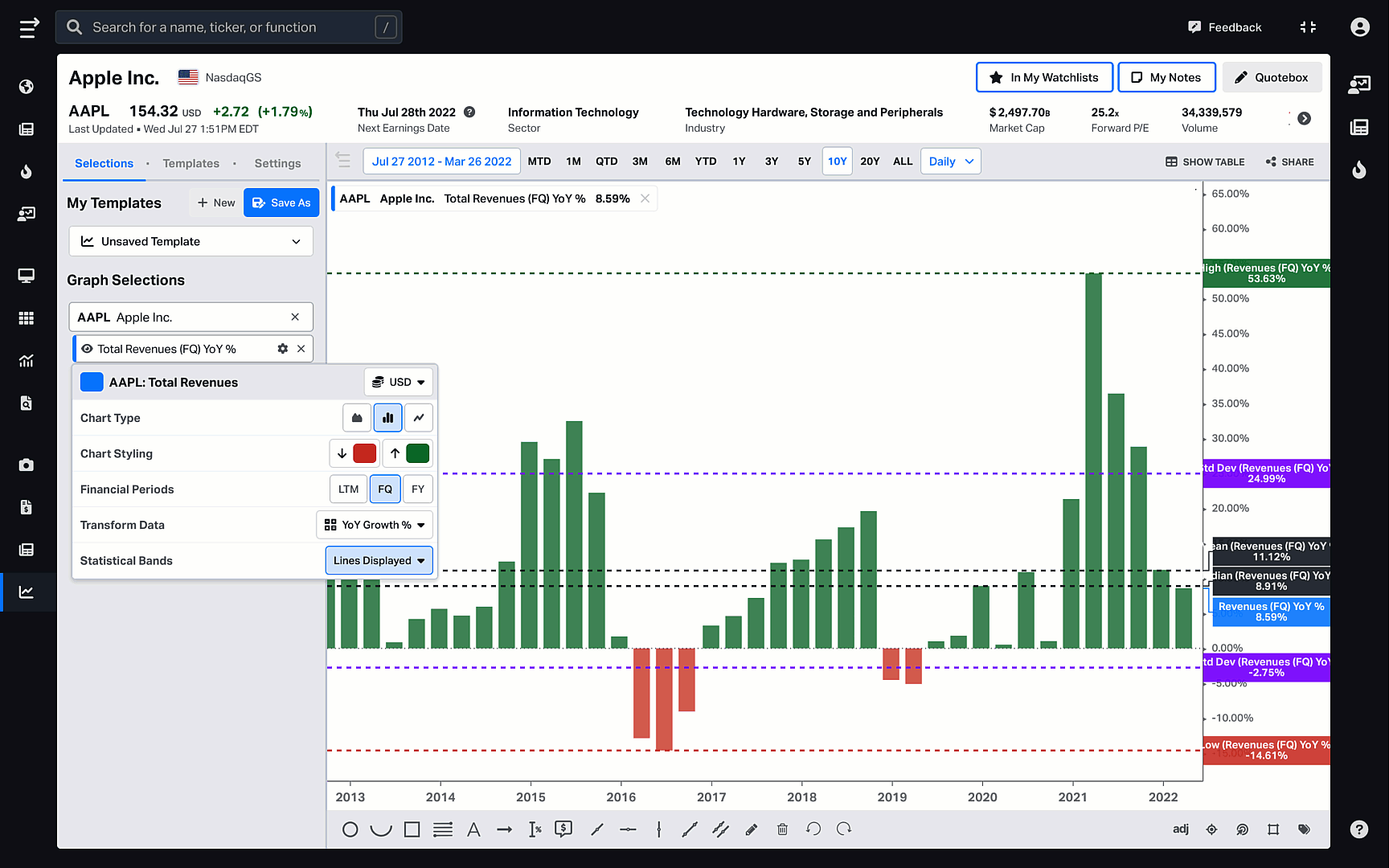
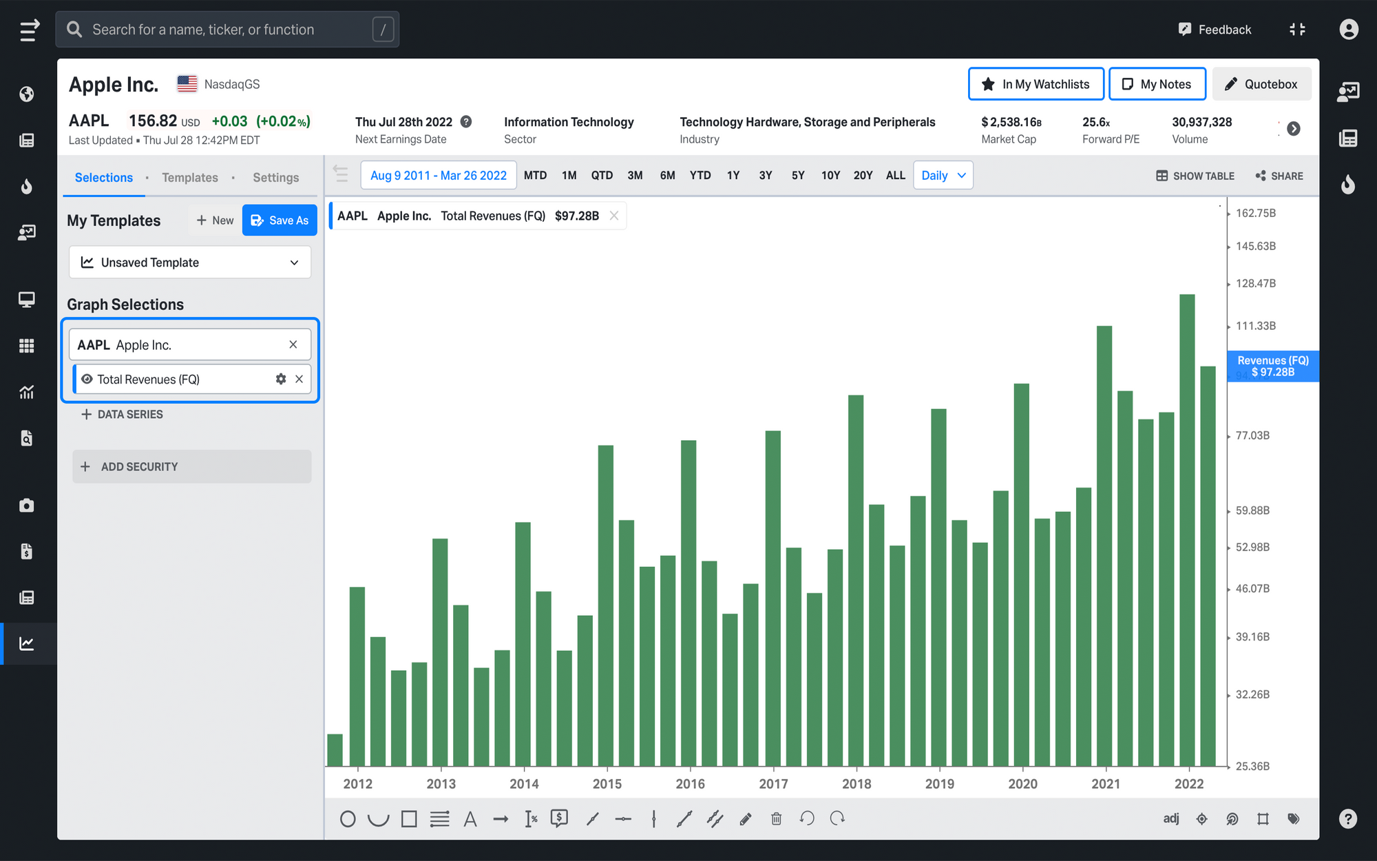
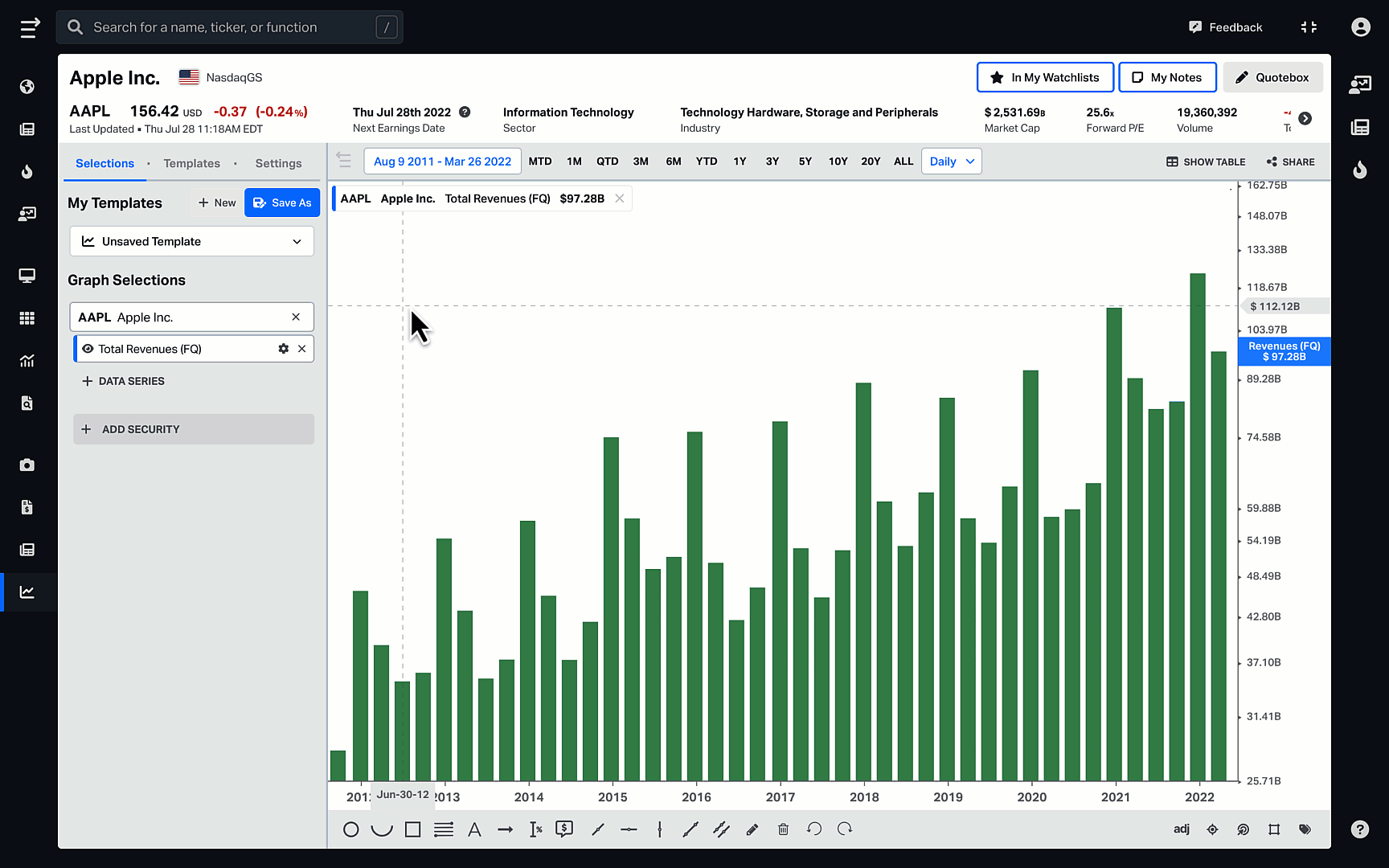
For example, let’s say you want to see how the Total Revenue for Apple has changed quarterly over the last 10 years. Click on +Add Security to select AAPL, click on +Data Series to add Total Revenue (FQ), and you will get the graph that shows all the reported quarterly revenue numbers for Apple.
This chart, however, does not show you when the company experienced positive and negative investing growth for the chosen period. That’s why we decided to augment it with the new graph transformations functionality which gives a much more granular view of security analysis.
To open graph transformations, click on ⚙️ Settings next to your chosen data series and select YoY Growth % from the Transform Data dropdown. By choosing simple transformations like this, you see the big picture more clearly and spot trends faster.
Statistical Bands
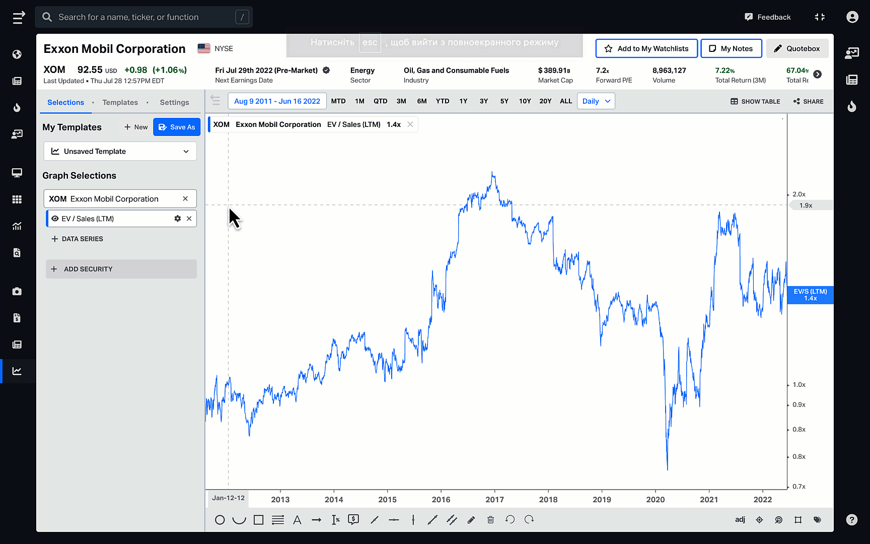
You can now also calculate a variety of statistical measures for valuation ratios and fundamentals. These include:
- Mean
- Median
- High
- Low
- +1/-1 Standard Deviation
- +2/-2 Standard Deviation
To do that, first, choose security and the data series to analyze. We’ll use XOM and EV/Sales (LTM) as an example. Then click on ⚙️ Settings next to your chosen data series, and in the Statistical Bands dropdown, mark the bands you want to display on the graph. You will then see how the company is trading compared to its statistical bands and the deviation from its average.
Check out this video demo to see how to get the most out of Graph Transformations:
To get more information on Koyfin functionality, take a look at other Help Center documentation or check out our YouTube channel.